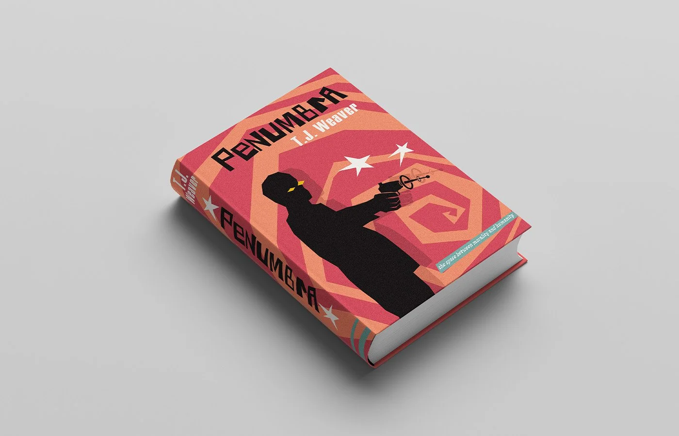
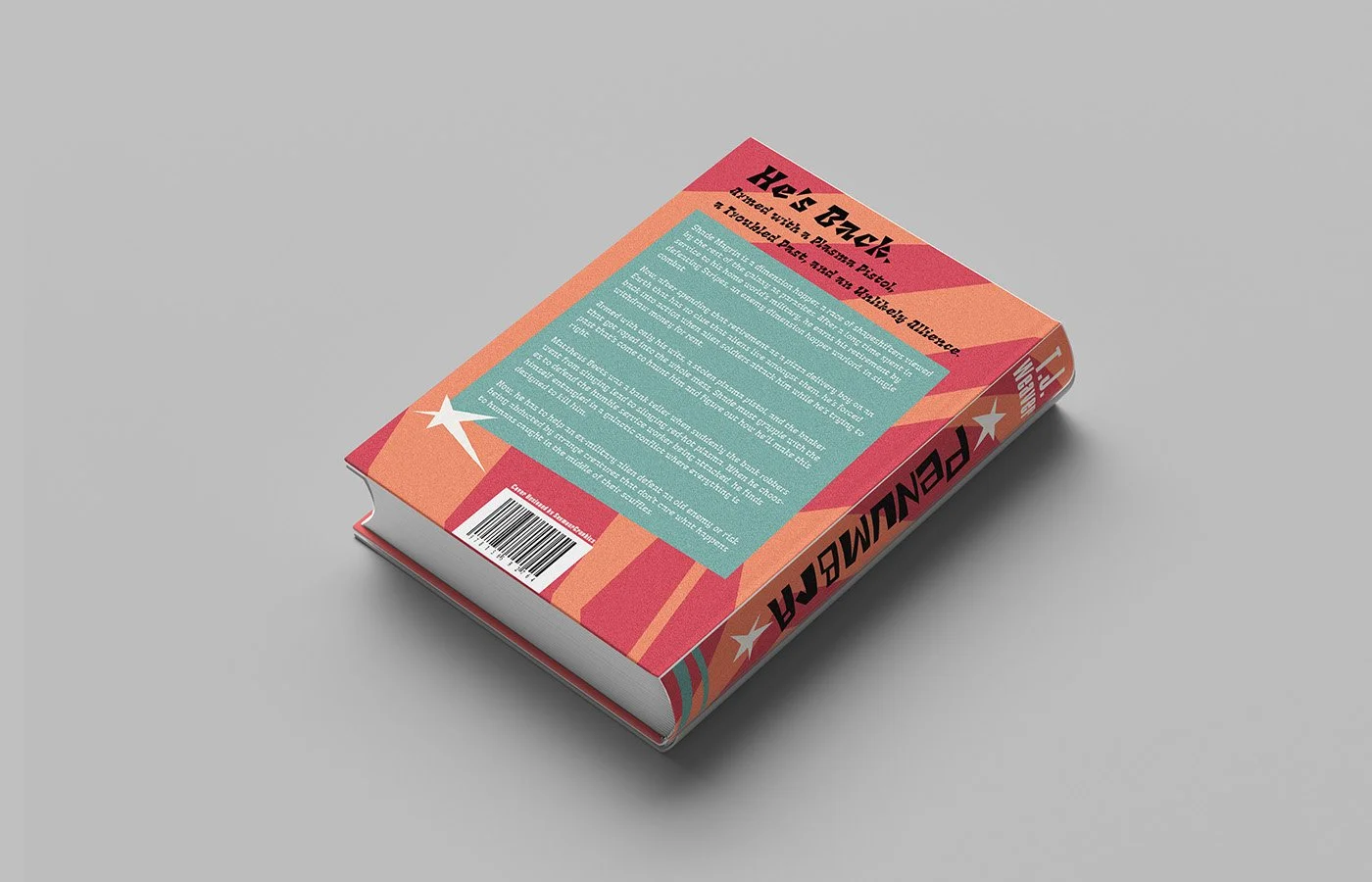
Book Cover Mockup
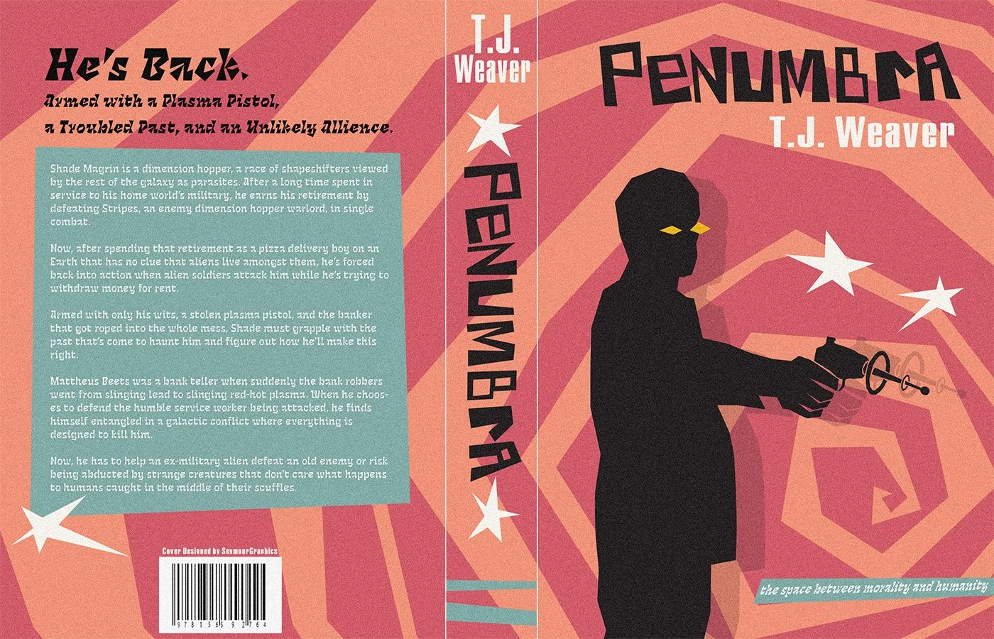
In collaboration with a creative writing class, I designed a mock book cover for an action–sci-fi novel. The concept draws heavily from 1960s spy film aesthetics, pulling from retro-futurism.
The story itself was intentionally wacky and offbeat. I avoided the ultra-serious tone of modern action thrillers. Instead of leaning into something John Wick–style, I aimed to strike a balance between fun and cool. Bright yet slightly muted colors, paired with classic sci-fi imagery, helped ground the design while keeping it light and self-aware.
The book was written by T. J. Weaver and was never officially released, making this project a purely conceptual exploration of tone, genre, and visual storytelling.
For this project, I created a series of mock advertisements for the brand Velour Garments, designing for multiple platforms and formats. The selected work includes a bus stop ad, an Instagram post, and a Facebook post, each tailored with intentional design decisions to suit its medium and audience.
Velour Garments Advertising Mockups
Bus Stop Advertisement
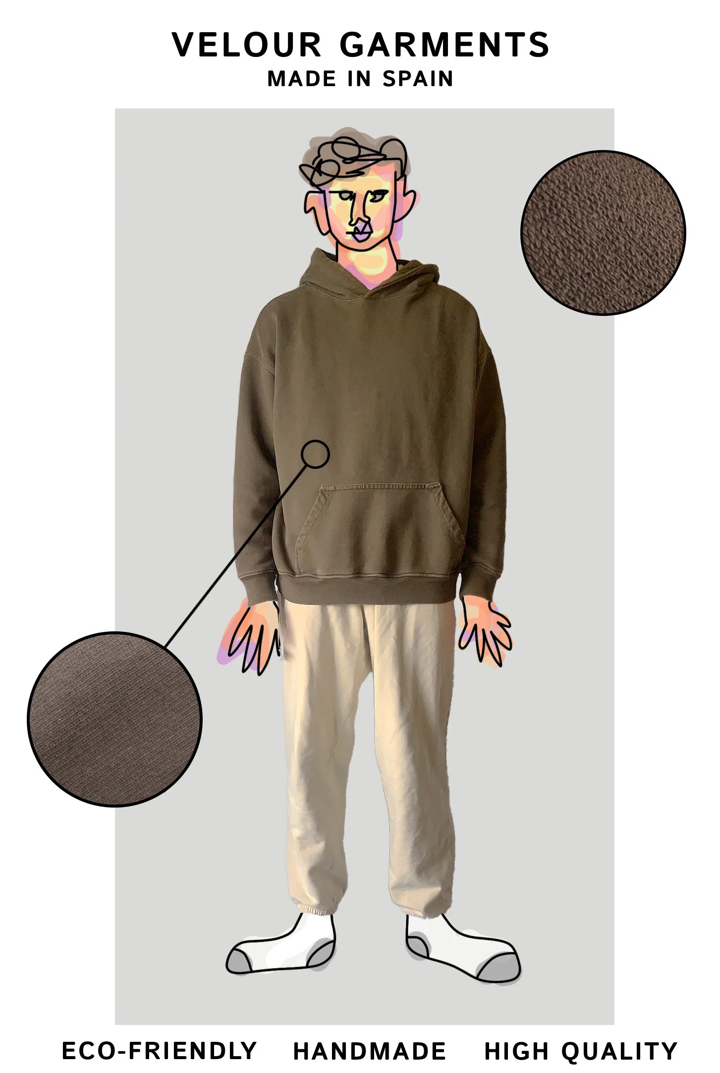
This ad leans more heavily into graphic design than the others Because the garments themselves are minimal, high-quality, handmade blank pieces. I needed the layout to do more of the attention-grabbing. With viewers likely walking past quickly, I introduced bold graphic elements to stop the eye. The secondary message emphasizes the craftsmanship and quality of the brand, reinforcing its value once attention is captured.
Instagram Advertisements
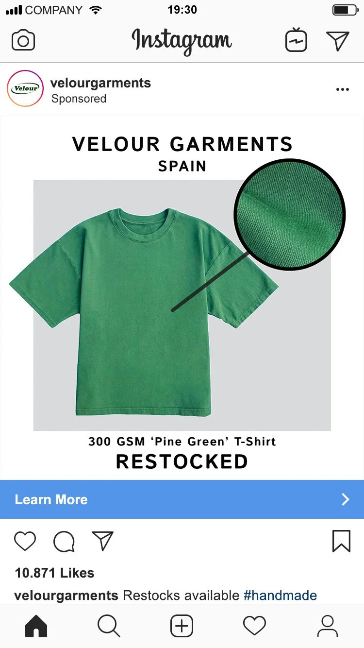
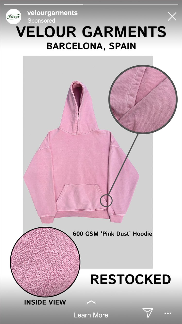
For Instagram, I shifted toward more information-forward visuals. These ads highlight fabric quality through close-up shots. They clearly communicate that the brand is based in Spain, showcase popular bright COLOR WAYS, and signal product availability. The use of the word restock suggests high demand and urgency without relying on overly sensational language, aligning with a more thoughtful, design-conscious audience.
Facebook Advertisement
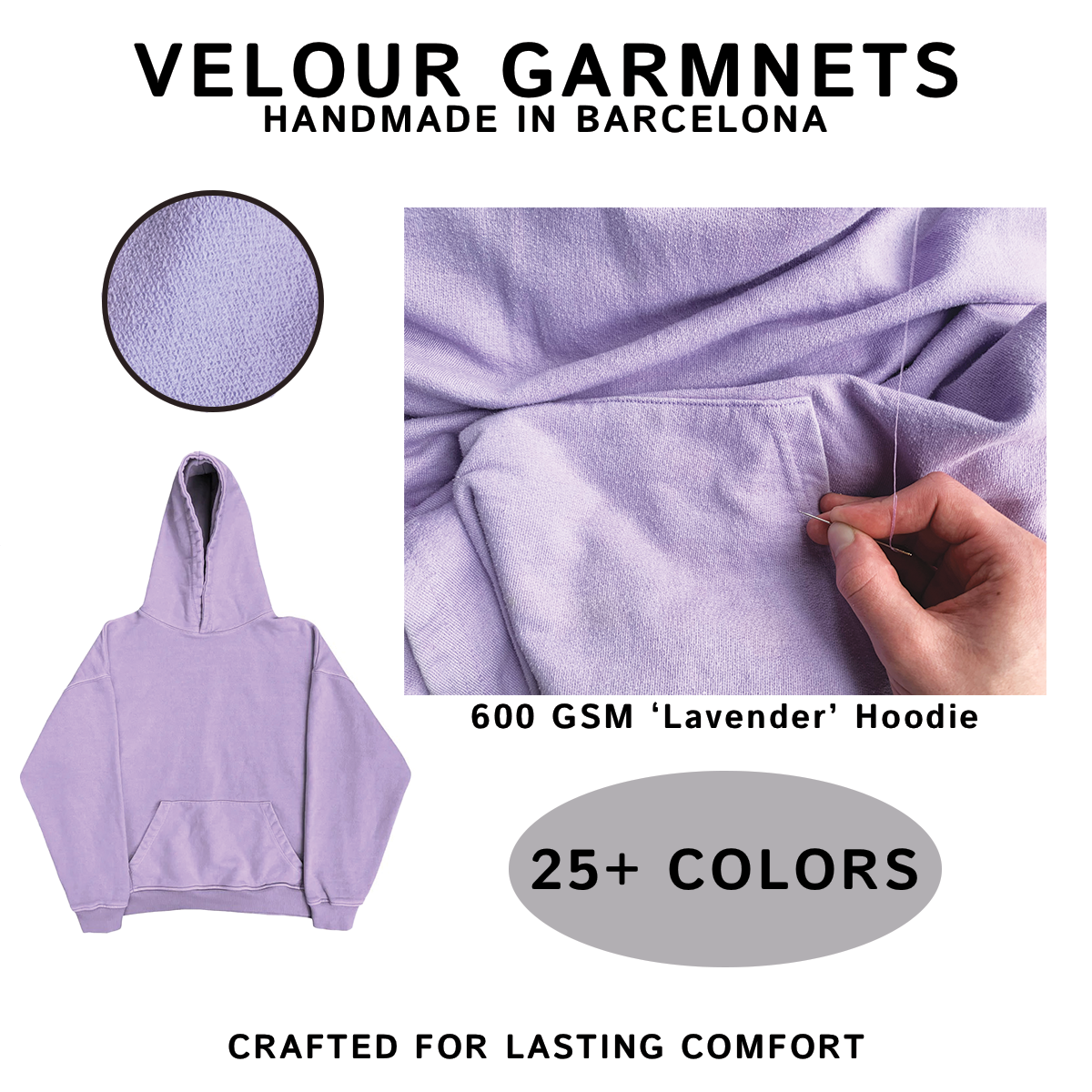
For Facebook, aesthetics took a back seat to clarity and value. With an older audience in mind, I prioritized information that reinforces trust and craftsmanship. The imagery focuses on the handmade process, showing someone sewing the hoodie, while copy highlights customization, quality, and the availability of over 25 colors. This approach positions the product as intentional, well-made, and worth investing in.
Midway Deli Drink Menu & Music Schedule
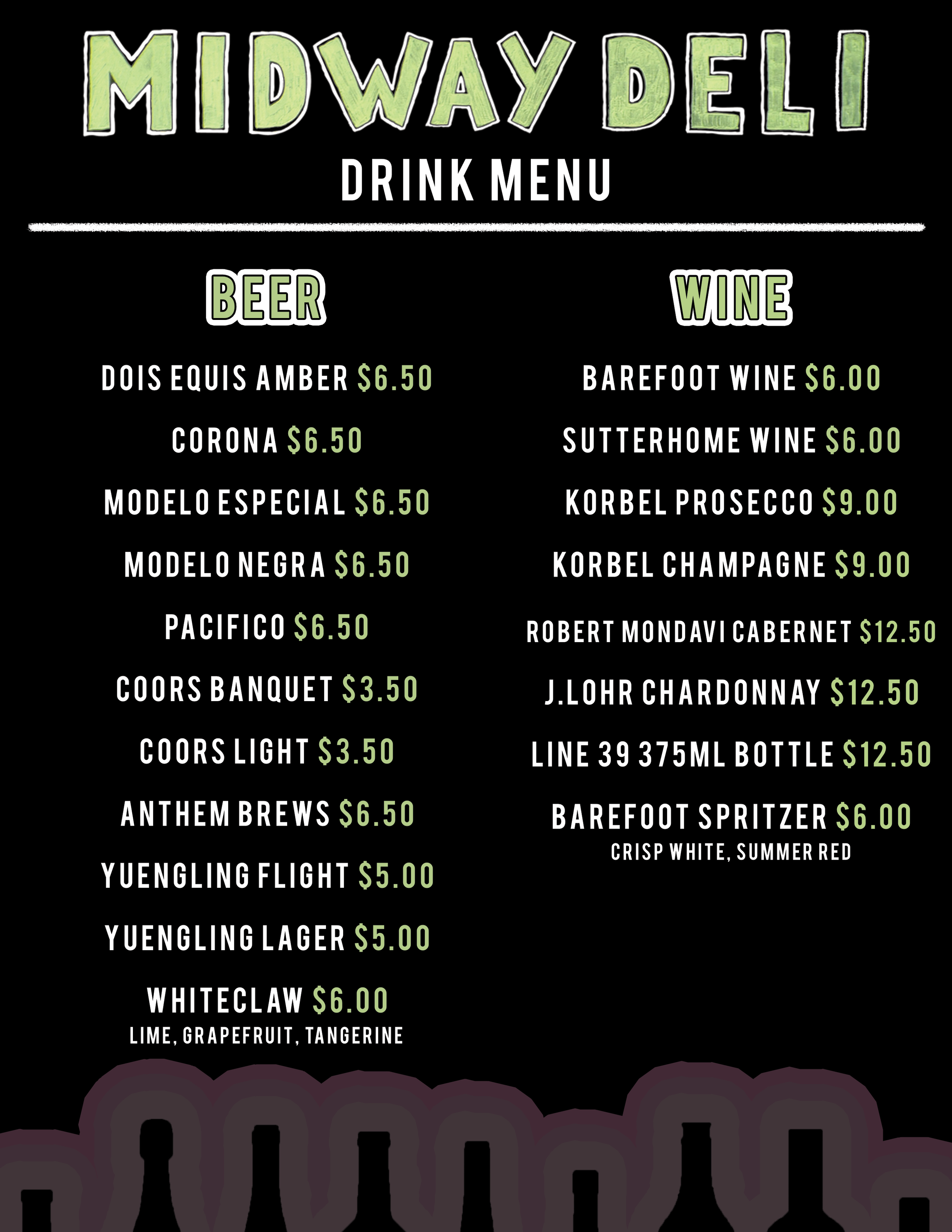
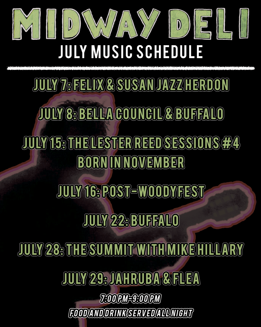
While working at Midway Deli in Norman, Oklahoma, I designed a drink menu and live music schedule that was featured both on the restaurant’s website and physically inside the space.
I used the existing logo as the foundation for my color palette and typography, ensuring the designs felt cohesive with the brand. I chose a darker, moodier aesthetic to match the late-night atmosphere of the deli, since both the drink menu and music schedule were most relevant during evening hours.
The restaurant is filled with retro music posters, which influenced the pink outline treatments used throughout the background elements. The result is a set of clean, simple designs that prioritize clarity and readability while still feeling visually engaging and aligned with the space.