COver Art
& Conceptual Posters
Books and Movies - Single Hank Garrett
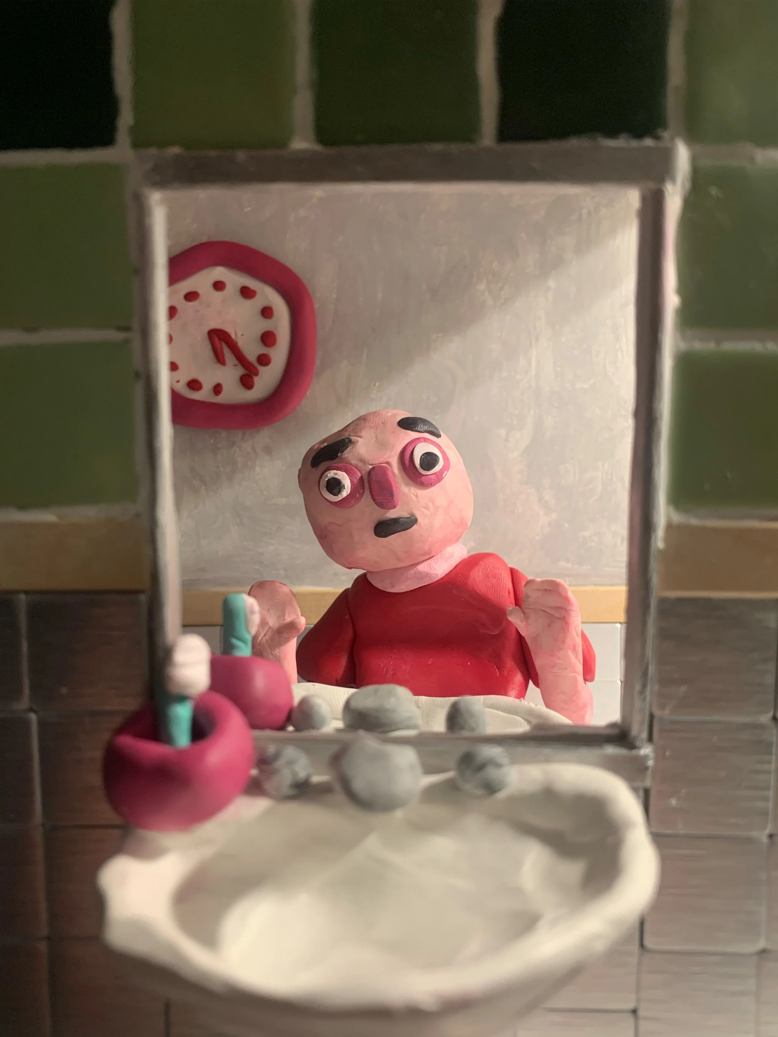
2024
Books and Movies was the first cover Hank and I collaborated on, and at the time it was my most ambitious project to date. I built a full physical set for the background, fully modeled a polymer clay character, and experimented with lighting to bring the scene to life.
The set was constructed using foam board, ceramic and aluminum tiles, popsicle sticks, acrylic paint, and polymer clay. The element I’m most proud of is the mirrored effect. By recreating the sink and toothbrush on both sides of the set, I was able to create a convincing illusion of reflection rather than relying on digital manipulation.
Unlike my later covers for Hank, this design stayed fundamentally the same from start to finish. The final decision came down to choosing the exact camera angle that best communicated the scene.
The cover captures the emotional core of the single: the quiet moment of giving yourself a pep talk before a difficult conversation with a lover. It reflects vulnerability, nervousness, and the weight of unspoken thoughts—everything you rehearse in the mirror before stepping back into the world.
Honeydew EP Hank Garrett
2024
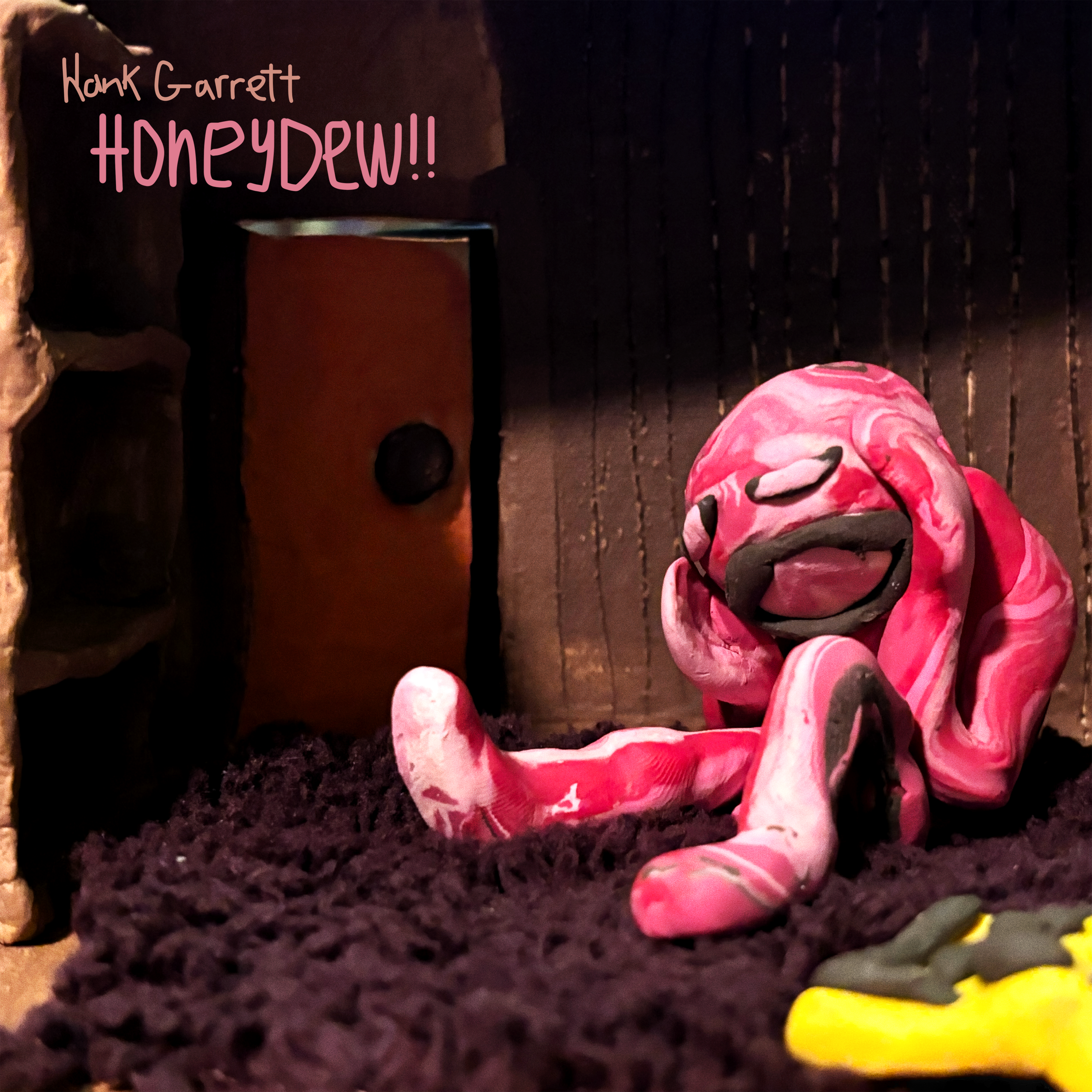
Honeydew is a 5-track EP by singer/songwriter Hank Garrett, released in 2024. The project originally began as a single, expanding over time into a full EP. This album cover represents the first complete draft of the visual identity created during the early stages of that growth.
I collaborated closely with Hank throughout the development of the project as both the music and its visual language evolved. Over the course of a year, the cover went through numerous iterations/ Ranging from subtle refinements to radical reworks, mirroring the way the EP itself matured. The first version of the project was much more raw, and emotional which is reflected in this version of the artwork.
The background was created using mixed media, including ceramic clay, fabric, polymer clay, and acrylic paint. The central character was sculpted entirely from polymer clay. The final image was composed and refined in Adobe Photoshop, blending physical texture with digital polish.
This early draft captures the emotional core and direction of Honeydew, serving as a visual starting point that informed the final album cover.
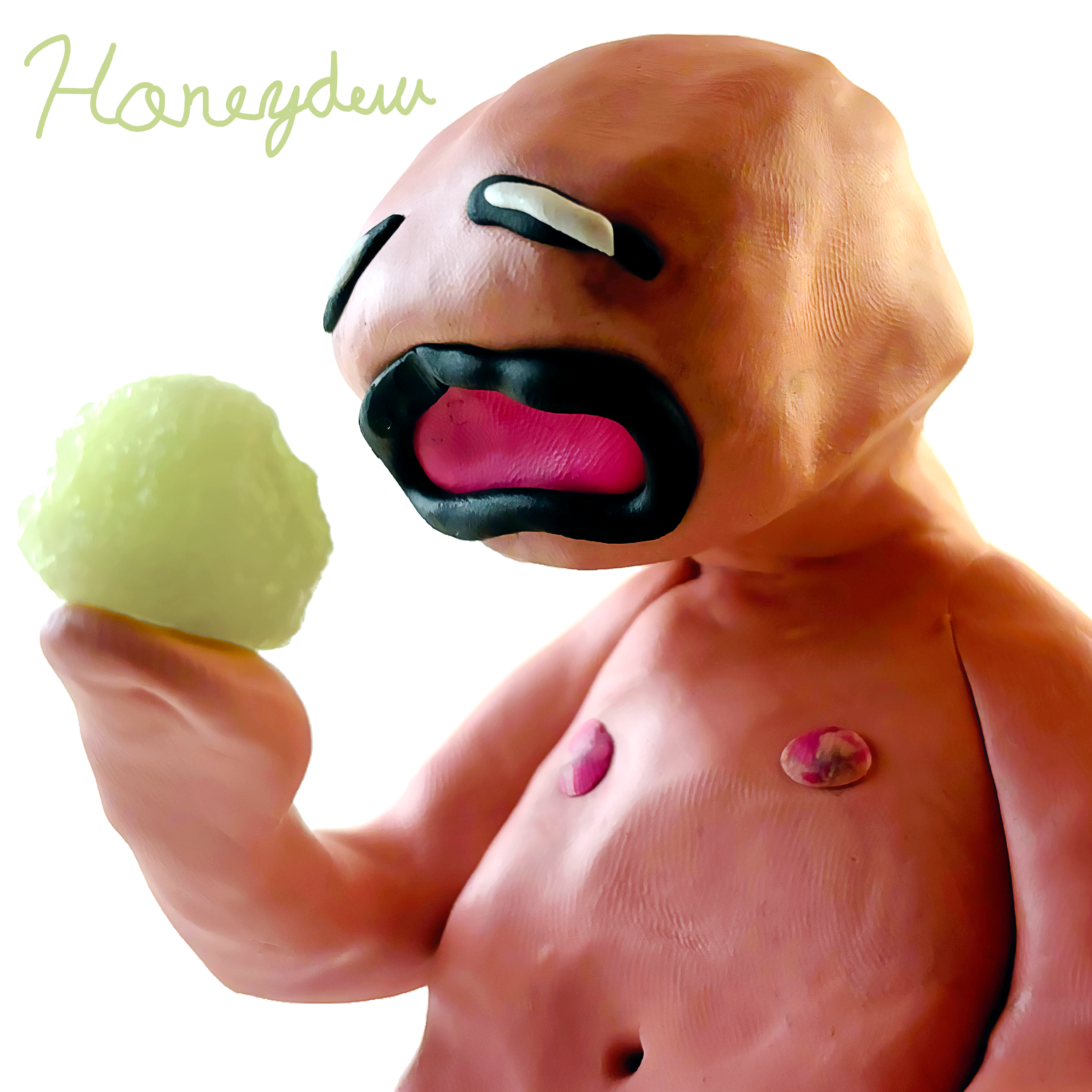
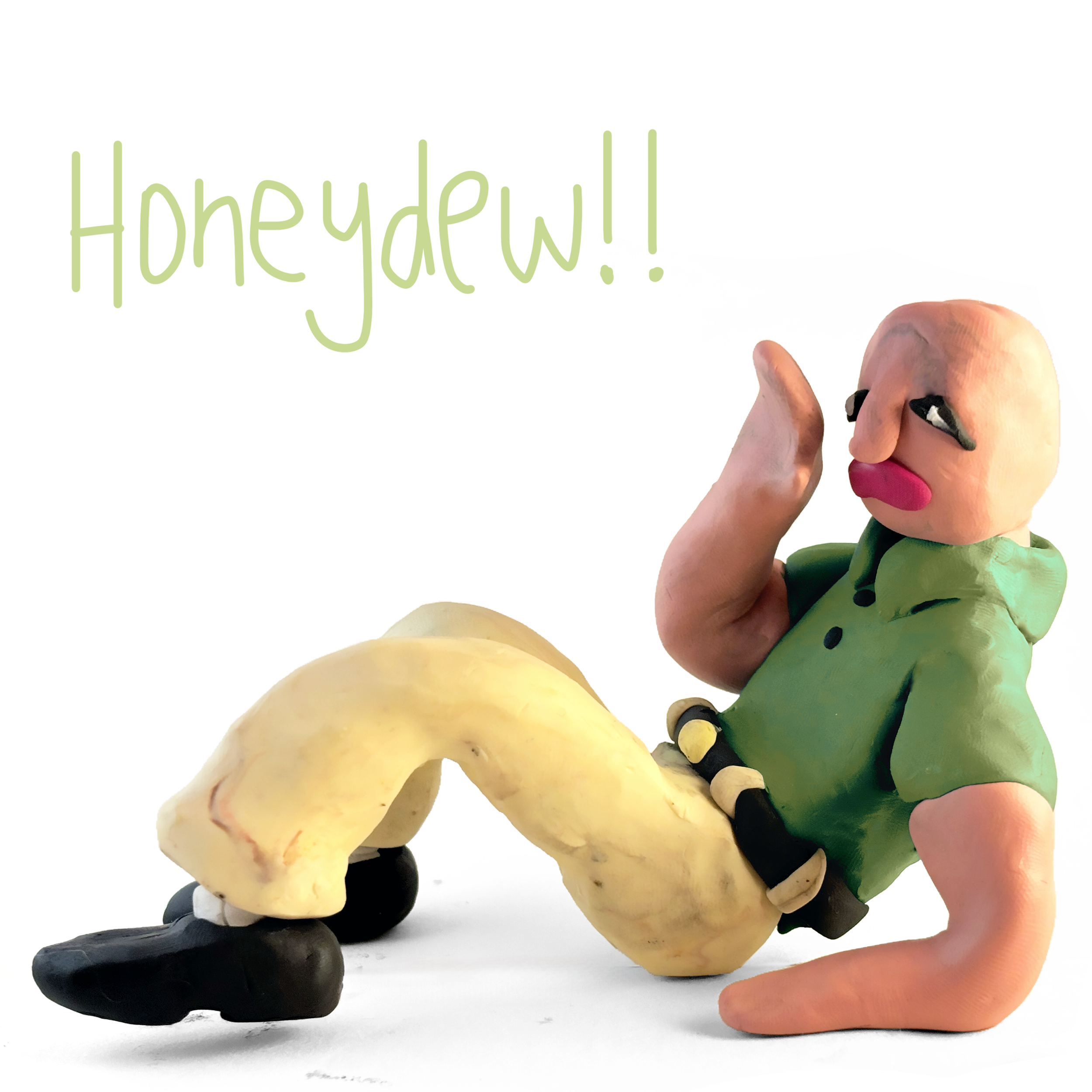
As the Honeydew project shifted toward a more alternative sound, the visual direction followed. For this second draft, I intentionally moved away from the dense, mixed-media background of the first version and replaced it with a stark, minimalist white backdrop, allowing the character to feel more exposed and uncanny.
At this stage, I leaned more literally into the EP’s namesake by introducing a real piece of honeydew, held by the character like a crystal ball. The figure stares into the fruit with an eerie stillness. While the wailing facial expression remains from the previous draft, the body language is noticeably calmer, creating a tension between emotional intensity and physical restraint.
This version pushed the project into a stranger, more surreal space. I also heavily experimented with typography, testing all-caps treatments, hot-pink lettering, and messy handwritten styles. The final type choice shown here felt most aligned with the tone of this iteration.
Ultimately, while this second draft helped clarify the boundaries of the project’s visual identity, it proved too unconventional for the direction the EP would take. Even so, it played an important role in shaping the final cover by exploring the outer edges of the concept.
This is the final and officially released album cover for Honeydew - EP by singer/songwriter Hank Garrett. This version reflects how refined and intentional the project became as the music matured. The visual direction evolved alongside it, shifting from a loose, exaggerated character style to a more grounded, human full-figure presence.
The design incorporates the signature honeydew green throughout the composition, appearing in both the typography and the character’s shirt. It continues the minimalist approach introduced in the second draft, using a clean white background to create space and restraint. The character is intentionally scaled to leave room to breathe, reinforcing the calm, considered tone of the final project.
Compositionally, this version required the most refinement. Multiple poses and angles were explored and ultimately discarded in favor of the final arrangement shown here. Every element was carefully adjusted to achieve balance, clarity, and emotional alignment with the music.
The resulting artwork feels cohesive and resolved, serving as a visual counterpart that complements the tone and maturity of the EP.
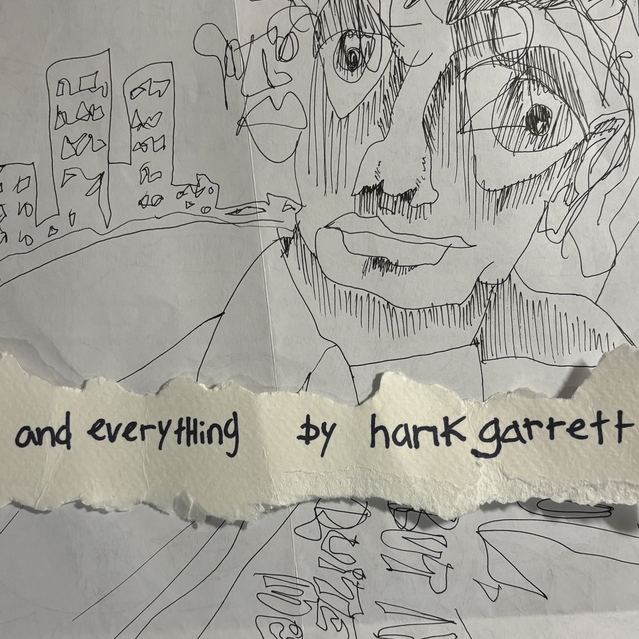
And Everything hank garrett
2025 - Released by Harbour Artists & Music
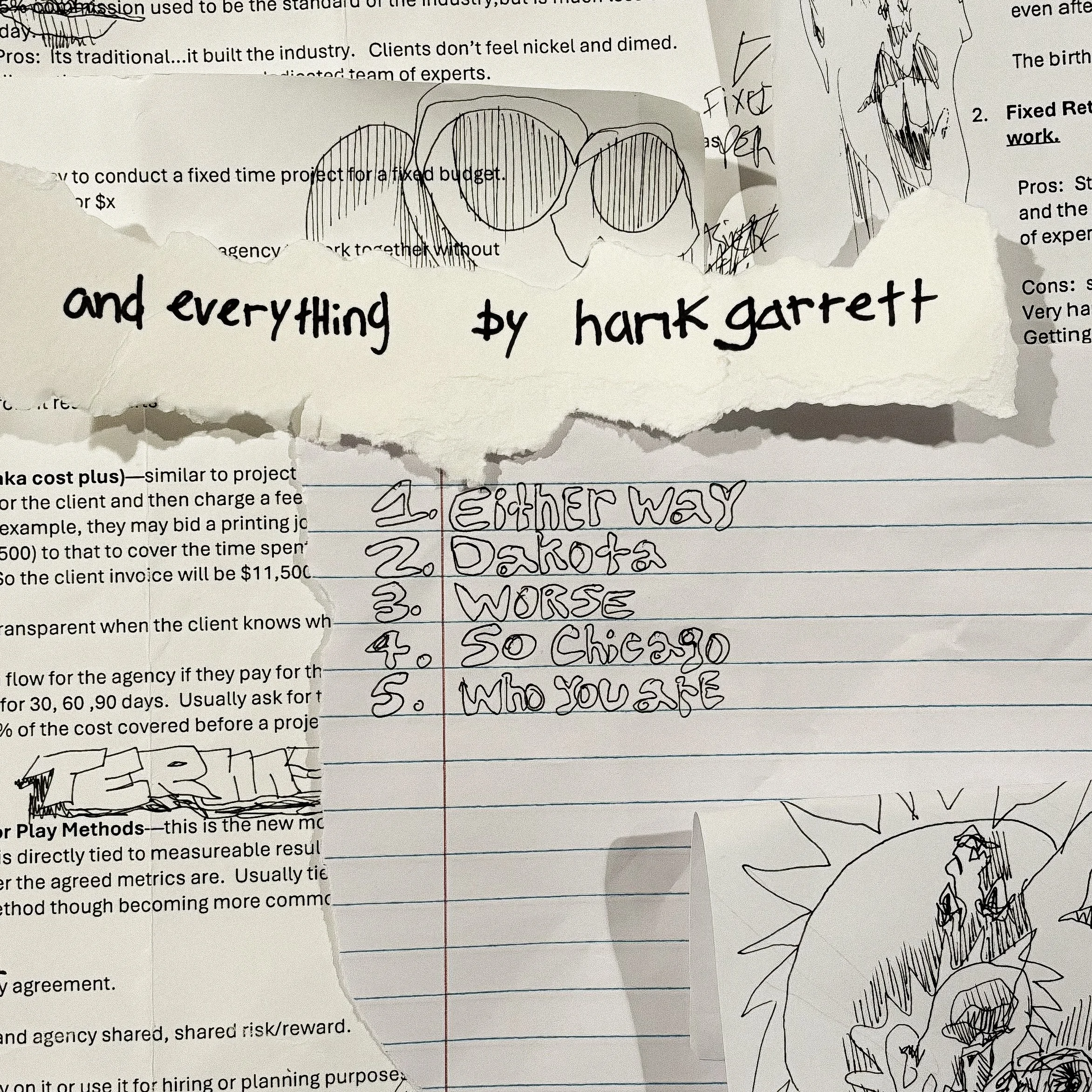
The cover art for And Everything – EP by Hank Garrett went through several iterations. The first direction was a digital, text-focused design. From the start, Hank and I agreed that minimalism and typography-led visuals were the right approach for the project.
This mockup represents the foundation of that direction. By incorporating a variety of colors and handwritten type styles, the design communicates the idea that the EP contains “a bit of everything” without becoming visually overwhelming. The goal was to strike a balance, using as little as possible while still conveying as much information and personality as possible.
The second iteration introduces a more layered approach, combining overlapping sketches, crumpled paper textures, and delicate ink lines. While more visually active than the first version, the design still prioritizes restraint and negative space.
This direction was influenced by projects such as Here Comes the Cowboy Demos by Mac DeMarco and 3 Gnossiennes and 3 Gymnopédies – EP by Erik Satie & Ikuyo Kamiya. The stylistic shift established here continues into later iterations as the design evolves and builds on these ideas.
The third iteration incorporates sketches and paper ephemera from my time in college. This version shifts to a text-focused approach in a different way than the first, intentionally overwhelming the composition with text. While the sketches take more of a backseat, they remain visually present within the layout.
I continued using the same title paper, but introduced a handwritten track list to add a more personal layer. This was the final black-and-white version presented. Although the balance between minimal structure and visual overload was engaging from a design standpoint, the concept ultimately did not align with the tone of the EP being released.
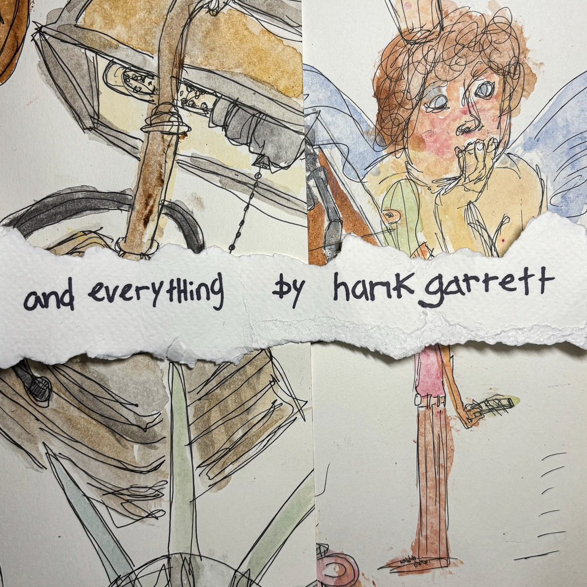
This is the final version of the cover. Ink sketches and watercolor are used to create a messy, colorful, handmade feel. The title paper remains, while multiple layers of sketches and textures form the overall composition.
This iteration brings together everything explored in the previous three versions: introducing color, layered paper, and “a bit of everything,” while keeping a text-based centerpiece that remains legible and grounded amid the surrounding imagery. The result captures the tone of the music and serves as a strong visual introduction to the project.
The system also leaves room for expansion into clothing, posters, and digital advertising, allowing the visual language established here to extend consistently across future applications.
Album Cover & Movie Poster Mockups
Art Direction and Design course (JMC 3473)
Original
my version
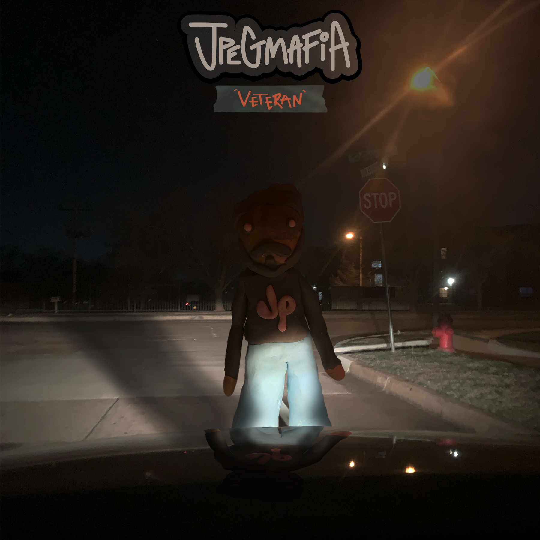
For my interpretation of JPEGMAFIA’s album cover, I created a physical clay sculpture of the artist to ground the project in a tactile, real-world process. To inform the lighting and atmosphere, I photographed myself standing in front of my car’s headlights and used that image as a reference for shadow placement and reflections in the final composition.
I aimed to emphasize an eerie, unsettling tone to visually reflect the sound and mood of the album. For the title typography, I drew inspiration from early web aesthetics. Specifically old browser games and Newgrounds-era free-to-play titles, to pay homage to JPEGMAFIA’s recurring use of both contemporary and nostalgic internet references. The text treatment mirrors the visual language of those early game title screens.
The final cover captures the intensity of the music while maintaining design elements that feel distinct and authentic to the artist. Displayed side by side, the inspiration image and final artwork highlight the transition from concept to execution.
(created using Adobe Photoshop, Adobe Illustrator and Adobe Lightroom and Polymer Clay)
‘Veteran’ album by JPEGMAFIA (2018)
Original
my version
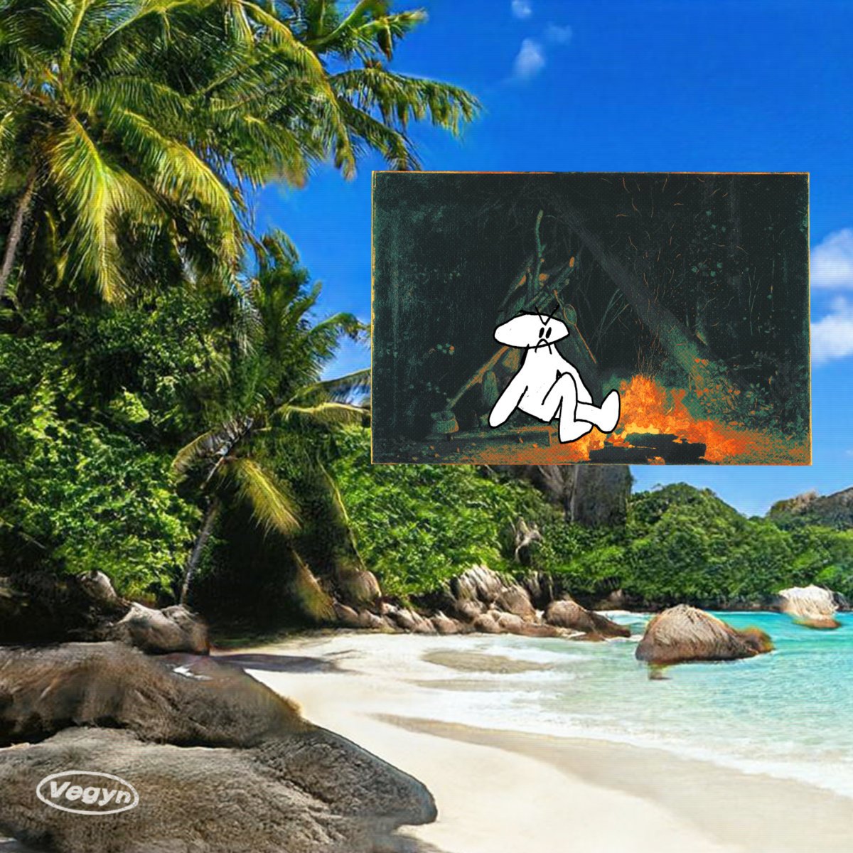
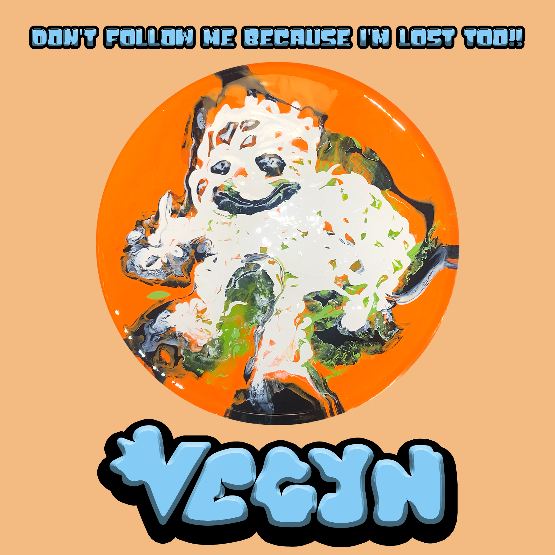
‘Don’t Follow Me Because I’m Lost Too!!’ album by Vegyn (2022)
For my interpretation of Vegyn’s album cover, I again worked with physical media to create a tactile, hands-on result. Using a pouring technique with heavy amounts of paint on a ceramic plate, I reinterpreted the character from the original cover in a fluid, glossy form.
I maintained the original color palette while significantly altering the composition to preserve the album’s identity and introduce a more organic, human quality to the artwork. The flowing paint and reflective surface emphasize flexibility and motion, echoing the emotional range of the music.
The typography draws from Y2K-era design, which complements the album’s upbeat and nostalgic sound. Visual references included SEGA titles such as Sonic the Hedgehog and Jet Set Radio, whose bold, playful aesthetics informed the final text treatment.
(created using Adobe Photoshop, Adobe Illustrator, Adobe Lightroom and Acylic Paint)
Original
my version
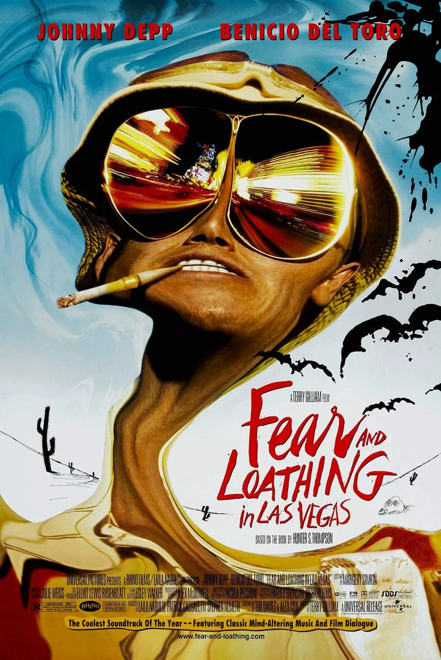
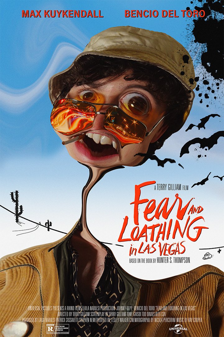
‘Fear and Loathing in Las Vegas’ directed by Terry Gilliam - based on the book by Hunter S. Thompson (1998)
For this movie poster project, we were tasked with recreating posters from our favorite films as faithfully as possible. This required photographing original imagery that matched the source material, then rebuilding assets, filters, typography, and composition to closely mirror the original design.
The most challenging elements to replicate were the reflections in the glasses and the hand-drawn ink illustrations inspired by Ralph Steadman’s work. Both required careful attention to detail to accurately capture the texture, distortion, and irregular line quality of the original poster.
The final result is a faithful recreation of the iconic film poster, with myself as the subject, staying as true to the original as possible while demonstrating technical precision and attention to detail.
(created using Adobe Photoshop, Adobe Illustrator and Adobe Lightroom)
Original
my version
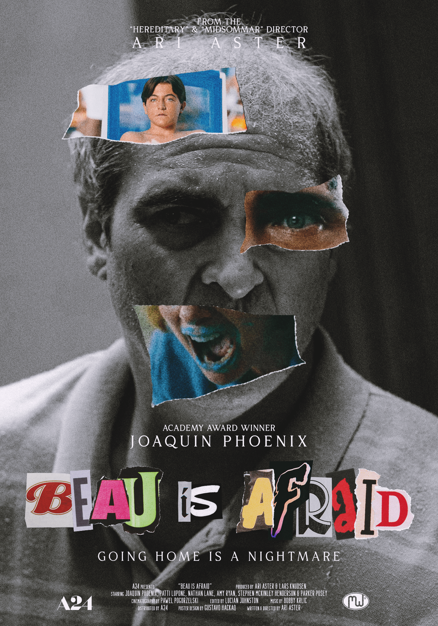
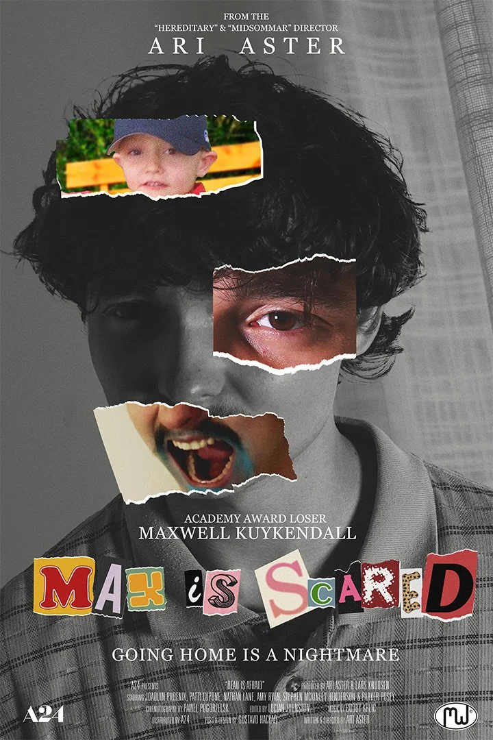
For my Beau Is Afraid poster, I intentionally chose a design approach that differed from my Fear and Loathing recreation. Rather than relying heavily on photo manipulation, this poster required a larger volume of photographic and typographic assets.
I took multiple photos to closely match Joaquin Phoenix’s expressions, including painting my mouth blue for the lower image. To recreate the childhood imagery, I sourced photos of myself as a child to align with the appearance of Phoenix’s character at a younger age.
Typography was the most time-consuming aspect of the project. The final treatment combines multiple digital fonts, paper textures, and scanned magazine text to achieve the torn, collage-style lettering seen in the original poster.
(created using Adobe Photoshop, Adobe Illustrator and Adobe Lightroom)
‘Beau is Afraid’ directed by Ari Aster (2023)